Sunday, December 13, 2015

"One Night Only!!"


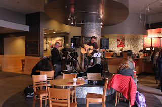
One Night Only!! is a live performance piece that comments on coffee shop culture, environmental issues, live performances, and the human condition.  The audience is encouraged to play along through the use of a MIDI keyboard that plays sound effects and vocal phrases rather than musical notes.

The piece took place on December 7th, 2015 from 1-3:30pm at the University of Nevada, Reno Joe Crowley Student Union Starbucks. I played some of my own songs, two covers, and the rest were improvised on the spot. 

I think the project turned out well. I played the entire time, the audience "played along," and I didn't even once quit playing mid-song when the keyboard went crazy (which was very hard to maintain my composure). The only thing I wish I could've done differently was have my guitar case set up directly in front of me instead of on the side and that the keyboard could've been on it's own miniature stand and ornately decorated but there was no way to house my computer, PA mixer, and keyboard cables in any fancy manner while also giving me easy access incase of technical difficulties.

I was relieved that I didn't get kicked out at all. One of the employees came over and played the keyboard and laughed because he understood my purpose and how accurate the phrases were to things he'd hear every day and how asinine the average college coffee crowd sounds. My friend Dale brought his 5 year old son Wyatt who LOVED playing the keyboard and he would show people how it works with the pitch wheel and everything. Wyatt would slam down every key and customers would plug their ears and look annoyed because it was so deafening. I don't think many of them understood that I'd like to do the same when they open their mouths at all.

Overall, I'm glad there were no computer problems and the keyboard hung in there the whole time. Some people got it, others didn't. It was just fun interacting with people and seeing how they took my project as a whole as something out of the ordinary and most likely obnoxious. I loved it. I had a lot of fun and some of my friends did as well. 

Here's some videos and pictures documenting "One Night Only!!" with thanks to Emma Carter, Elizabeth White, Rachel Dickson, and Joe DeLappe for taking them. 


The guitar case. Like a busker.
How most of it went: alone.
Zachary playing along
The keyboard.

Rachel playing along

Elizabeth playing along


Professor Joe DeLappe playing along


Cory Arcangel (Web Lecture Review)

I was very happy to see that there was a web lecture given by Cory Arcangel. Since starting in the digita media program, I've wanted to hear Arcangel talk about his work and this was a great way to experience it.

I was really impressed with the Beige Records project of the Commodore 64 / Atari vinyl record with various sounds for DJs with some just being things to scratch over, basic clips, and one track to play through like a normal album. Arcangel's details in the grooves was interesting in how they differed from normal or even concentric grooves and that there was something etched in where it pulls all the data off the vinyl and can work on a computer. That's crazy and very interesting.

"I Shot Andy Warhol" was a funny Nintendo game hack that Arcangel did where he made his own characters and put them into the original game, "Hogan's Alley." It was a basic and easy thing to do for Arcangel because he just put in his own characters of pixel art into an existing game.

Much of Arcangel's work is centered around him exploring coding and programming and tweaking as little data as possible. Some call it lazy, which I may tend to agree with except for the fact that it's so funny and asinine, but Arcangel actually knows what he's doing and could do any project from scratch but he explores what has already been done. "Super Mario Clouds" is probably his most famous of these Nintendo graphics hacks, which I saw in person this summer at the Whitney in New York, but it shows what a minimal approach he takes with games of this nature. Arcangel's Tetris hack where he slowed down the time for everything was funny and extremely easy but something about it is so charmingly stupid, much like a lot of Arcangel's work. But, it's fascinating and should be appreciated for the fact that it's software exploration.

The final most interesting part about Arcangel's online lecture was his Pizza Party program that runs on the terminal and pulls data from Domino's's website and you can order pizza through it. The program is a basic text format and because it's cash on delivery, Arcangel took a hands-off approach on the ramifications his program could cause. I also like that Arcangel posts all his coding work so people can appropriate his work like he does of others. It's a great sign of transparency in his work and makes getting into the digital media field more enjoyable so people can have a hands-on approach to learning the software and how to manipulate it.

Arcangel is obviously funny and hip to modern times and his lecture was like something a brilliant student may give, not someone whose work is world-renowned in the biggest and best galleries. He's like the laid back artist that the youths wish were famous making funny, interesting, and intelligent art. I was happy to see that he wasn't as egotistical as other digital media artists and he's just a seemingly cool guy who likes making fun stuff for the sole enjoyment of himself.

Project Update #10

The MIDI keyboard programming is complete! This was the final step in making "One Night Only!!" the best it can be and I'm done!

Here's a video of what it looks and sounds like on it's own.


Thursday, December 10, 2015

Dexterity (Exhibition Review)

Dexterity is the annual student art exhibition which has recently returned after a hiatus. Three of the works came from the digital media students of this semester and last. Art 345's diptychs were among my favorite but I may be a little biased. My only wish is that the audio came out of a speaker rather than headphones. The Art 245 video art reenactments were interesting and took center stage as it was the first thing seen when entering the gallery projected on an entire wall. 

Tom Drakulich, who was just in the MFA Midway exhibition showcased two of his pieces from that show, "3" and "10." He also won one of the three $100 judge's awards of the night. I really dislike this work and thought there were others more deserving. 

Jena Valenzuela's "#perfection" was by and large my favorite piece which deservedly won one of the $100 judge's awards. The concept behind it of the endless scroll on Instagram seeking beauty tips and acceptance of others while making tip videos of her own without the use of a mirror is amazing. Using the same music from the original videos is equally impressive to make the new videos come off as no different than the originals besides the obvious messing up while hashtagging as many silly things as possible to fish for compliments and hearts. The display was near perfect, just like you'd see at a cell phone retailer where customers can demo the latest phones. Two pillars with phones on them looping Jena's videos of her own side by side in perfect tandem with another iPhone playing the original. The only downside was the headphones. I can understand if it's the gallery saying headphones are necessary so as to not distract from the other students' works but in the future, I hope the audio plays out of the iPhone's speaker. 

The final piece of the exhibition worth mentioning is Edwin Johnson's "Tug with Tow." The acrylic on canvas painting of a tugboat in rough seas is remarkable. The piece looks of professional gallery quality. The colors, depth, and style are beautiful. With it's endless amount of great qualities, Edwin ruined the painting by signing his name in the middle of a wave shortly left of center, first in pencil, then highlighted over in SHARPIE. The signature goes in the corner for a reason and the sharpie signature detracts from the beauty of the waves and open air. He might as well have cut the painting up or light it on fire because it's so sloppy, out of place, and is written in the non-cursive scribbling of a 13 year old's english exam. Super disappointing and I can only hope Edwin decides to paint over his crappy signature and move it to a corner. It has potential but remains worthless as it hangs now.

Overall, the student exhibition was very impressive and getting exposed to works outside of the digital media program was a great way to see the other art disciplines. Seeing what other students create inspires me to better the work that I make. 

Wednesday, December 2, 2015

MFA Midway (Exhibition Review)

The opening reception for the Masters Fine Arts Midway exhibition on November 12th was a packed house. Student Galleries South is the home of the Midway exhibitions held every semester and this has been my favorite so far.

Konah Zebert's "Kiowa Pond" was my favorite of the three. His photographs were astounding in their quality and overall composition. The way Zebert captured the reflections in the pond made me turn my head a few times thinking they were hung upside down; they were that clear. The framing and manner in which they were displayed were perfectly concise; the photographs spoke on their own with no fancy frills or layout. My favorite part was that the prints looked almost like paintings or three-dimensional. They were hypnotic and begged to be touched to confirm suspicions but the details were so well defined that they just had an illusionary effect.

In talking with Zebert, I found out that this was a place not far away from Reno where people would abandon their cars. Zebert chose this spot because of the stories behind the dumped cars. He wanted to know more about who did this and why. There were many cars in the pond but Konah brought out the beauty in their unappreciated existence. Nothing was tampered with and the shots are raw and real.

Quynh Tran's  "Recurring Dreams" was my second favorite of the evening. Taking up the entire back room, Tran's handmade paper adorned every square millimeter of wall space and a hanging sculpture hung in the middle. Tran made all the paper herself and cut each piece individually. There were a multitude of colors and they were each applied to the wall in random orders. It looked like one big wallpaper but there were a few pieces that revealed that each color was displayed independently.

The amount of work that went into the design, papermaking, and display must amount to days and it surely paid off. Tran made sure that there were no cracks anywhere and that no two colors were side by side. The sculpture of paper in the middle that hung down reminded me of the roots of the dragons used in Chinese festivals where people would be inside; the sculpture hung and twisted in a similar fashion. It's a shame that it was tucked away in the back room but is understandable. I want it in my house on my walls. It made me feel happy.


Tom Drakulich's "Tomorrow, Then" sculptures were my least favorite. They were black ceramic shapes like a vase but were distorted and twisted about. There were at least six of them that stood around at the entrance on white pedestals and I could tell that many people had to consciously avoid bumping into them.

I vaguely remember the possibility of them representing death in various stages but I feel that the sculptures were too abstract to convey any resemblance of death besides them being black. Having seen other works by Drakulich, I feel that "Tomorrow, Then" isn't as strong as his others.


Sunday, November 15, 2015

Project Update #9

I've received permission from the manager of the Joe Crowley Student Union Starbucks to perform "One Night Only!!" at 1pm on Monday, December 7th. This is very exciting and reassuring. The only stipulation, which I didn't intend to include from the beginning, is that there can be no filming.

I've worked out some of the major problems with getting specific clips to play on individual notes. I've switched to the Advanced Sampler instrument on Reason. There are still some minor issues with triggering them based on the amount of pressure when playing the keys so that will require some further inquiry for sure but I'm very glad that I've finally cracked the software to get it work the way I need it to. Each clip will play regardless of octave leaps which is a huge relief so I don't have to program everything individually 7 times. The pitch wheel will also modulate 6 full steps for some added fun.

With my breakthrough, I thought about trying to input everything on my full size keyboard but there's some compatibility error so my Alesis Q25 keyboard will still suffice. The full size would just make it look more official in a presentational performance setting.

Attached is a screenshot of how I'm setting up the synthesizer and I'm prepared to demonstrate an example in class using what I recorded for my previous update last week and can play live.


Monday, November 9, 2015

Philip Zimmermann (Lecture Response)

Skye Evans
11/8/15
Philip Zimmermann Lecture Response
            Philip Zimmermann is an internationally recognized book artist born in Bangkok, Thailand to diplomatic parents and he talked about all the interesting countries he visited as a child and how they were a bit of an inspiration in his work. Zimmermann gave an illustrious history of his childhood and how he came to be disciplined in Fine Arts after deciding against being an architect. Printing presses are romantic to Philip Zimmermann because of their smell, the sound they make, and the craftsmanship involved in using them.
Zimmermann prefers the preparation process to the printing and binding itself; he chooses not to bind his own books. When an audience member asked what the hardest part was for him, Zimmermann said that running the press would give him anxiety and he didn’t like getting his hands dirty. He also said that making artist books is difficult because of the little money that is made so he finds others to put up the money. Zimmermann taught for 24 years and his favorite was the artist books class and he advocated making dummy books to keep kids offline for as long as possible. He taught all parts of printing preparation and pressing to his students to get them ready for the real world and to have a better chance at finding jobs.
I found his lecture very interesting but I did not like that he read from a script for most of the lecture without glancing at the audience. My initial impression was, “This guy teaches? Does he know what his class looks like?” but the Q&A at the end was much more engaging because Zimmermann spoke frankly and unrehearsed. Zimmermann’s mention of Marshall McLuhan’s The Medium is the Massage as an inspiration grabbed my attention because I never studied the work as book art, only digital media, and I made an immediate connection. Zimmermann’s illustrations are really compelling and thought provoking. Once he pulled out Sanctus Sonorensis I made another connection because it is one of the books I knew.
My favorite work that Zimmermann showed was Celsius 233. The book is so smart in the way the reader sees the images of people burning books and the flame flap in the middle reads the description of whatever is opposite. The accompanying video showing the Third Reich in a blood-red filter burning books was incredibly powerful. Zimmermann’s idea of rear projecting the video on an entire wall with the book on a stand in the middle with illumination is the perfect way to display the piece as a whole. I wish I could see it in person. The book also comes with a blu-ray copy of the video. When Zimmermann showed how he had to display the piece on a small television with the book on a stand, my heart broke for him. That was an awful way to show Celsius 233 and I hope he can display it the way he wants to in the future.

The lecture was excellent as a whole and I was impressed that an artist of his caliber could come to the University of Nevada, Reno and share his life’s work with everyone. The only part that I did not like was the script but his life is fascinating and the concepts behind his work are completely new to me. Philip Zimmermann is a very humble artist who has worked anywhere and everywhere he could to hone his craft. While he may not be the best writer, his work is truly inspiring and is an experience in and of itself.